![]()
|
Review by Fred Meyer & Chris Chung
Pics by Fred Meyer: |
|---|
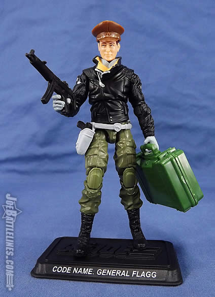
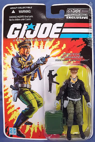
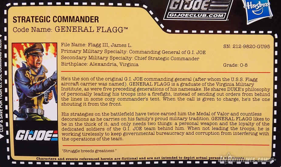
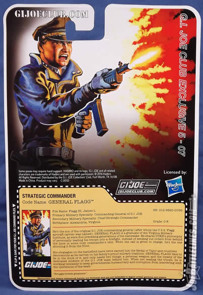
G.I. Joe Collector's Club Figure Subscription Service 5.0Strategic Commander - Code name: General Flagg
When it comes to the G.I. Joe: A Real American Hero, it’s hard to find a character that is more or less a blank slate. With a long-running comic title and two different animated series, the cast of the 1982 - 1994 was covered quite extensively. Yet there are gaps-- characters whose story was only told in the included file cards printed on the cardbacks and vehicle boxes of the classic line. As good as those printed dossiers were, they offered only the beginnings of a back story; only hinted at the personality and motivations of the men and women of the classic ARAH saga. Every so often, fans can still discover a character that still offers some room for interpretation. Case-in-point: General Flagg, Jr! This 1992 - 1993 alumni is the son of the original General Flagg and is just now receiving his first ever release in generation 3 construction. You know, I never really understood this figure’s purpose. The team was already top-heavy with brass, so why the son of the original General Flagg? Why not just make him thee General Flagg? Yeah, yeah, Flagg the Elder was dead, but so what? Plenty of fans completely ignore Hama’s universe, so he could have been a cool character existing outside the comic canon that could have added more heft to the ‘Joe team. Was he worth the wait? Read on and find out what two long-time Joe fans think of this newest arrival! Body Construction:
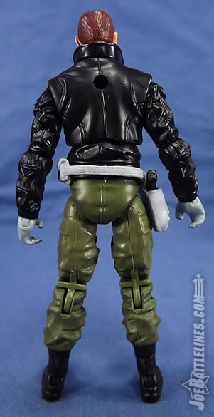
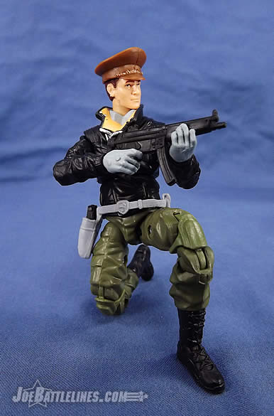
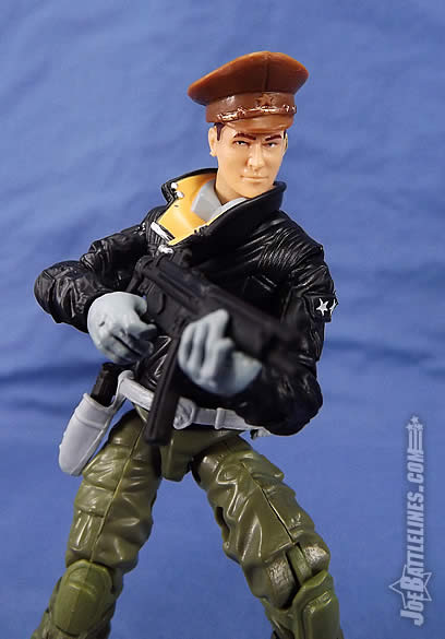
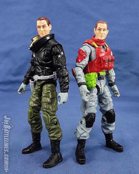
The construction of new figures in this era of limited new tooling is almost an art form. (Or an act of sheer desperation, depending on who you talk to.) Designers have to pour of an increasingly familiar catalog of pre-existing parts and still find new and meaningful combinations that evoke designs that harken back to the glory days of the ARAH era. For as much grief as reviewers give the Club designers, we still appreciate the effort that goes into trying to replicate a vintage design with parts that were never intended for that purpose. I agree to an extent, but in too many cases no effort was made on the Club’s part, so they don’t get a participation trophy just for showing up to work. The original 1992 - 1993 General Flagg design was pretty straightforward. The figure had a sculpted vintage World War 2 B-3 bomber jacket , BDU pants, and boots. Of the three elements described, two are pretty easy to recreate. The first, however-- not so much. As near as I can tell, the recipe for General Flagg is:
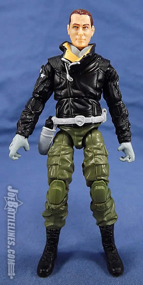
For the most part, this build works. It’s a bit odd to see the now-familiar PoC Duke lower legs with the kneepads unpainted, but overall coupled with the Shock Trooper uppers, the parts work quite well as both a vintage design homage and for offering solid mobility. No points for skipping the paint on the knee pads. However, when it comes to the simulating the jacket, the Club had to go off the reservation a bit, especially considering the fact that the 25th Anniversary General Hawk was released with a decorated leather jacket. Instead, the Club went all the way back to the Rise of Cobra era and utilized the torso of the second version of Storm Shadow. (This piece was also used in the “Ultimate Firefly” from the Retaliation line.) It’s a bold choice-- as it does somewhat evoke the open collar of the original 1992 sculpt -- but only barely. However, without significant new tooling I don’t know what other parts the Club could have used that would have helped Flagg to stand out from either Hawk or the FSS Keel Haul . They could have tooled a new head, but we’ll discuss this more below. I do take issue with the jacket, mainly the unzipped neck line. It sticks out way too far from the body and the tannish color they used on the inner lining draws extra attention to it in a most unflattering way. It actually looks like a locking ring collar on a space suit or something. It’s an awkward part, and one the Club should have went with something that better encapsulated the vintage design.
Colors:
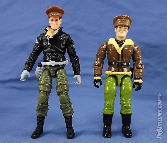
Near the end of the vintage line it wasn’t uncommon for a character to be released one year and then re-released the subsequent year with a different color scheme. As such, the Club had two options to choose from in terms of color scheme although in this case there is very little difference between Flagg’s releases. The 1992 version featured a brown bomber jacket and a black belt and gloves. The 1993 version changed the jacket to black and the gloves to gray. As was the case with the FSS Night Creeper Leader , the folks down on Cattle Baron Drive opted for the second lesser-known deco. Yeah, WTF is with this version? Most of these Battle Corps V-2 figs were backwash items placed in a wave to pad it for retail. But no real thought was put into them except, “The more obnoxious colors, the better!” And like that FSS turd Night Creeper Leader, we have one little fellow at the Club with a huge ego that power-tripped THIS version because that’s what HE wanted for his own personal Joeverse, and he’s gonna spend our cash to make it happen! Not cool Fred, not cool at all. Unlike the blind ninja warrior, the choice of the latter deco isn’t a bad one. The black jacket makes for a nice contrast from both the 25th General Hawk’s brown and the FSS Keel Haul’s maroon. The gray paint app on the figure’s sculpted shirt collar also evokes the classic Flagg design nicely. I will admit the the beige color used on the inside of the jacket collar struck me a bit busy at first but I’ve grown to like it the longer I’ve had the figure in hand The color isn’t bad on its own, but it’s not good either. The RoC line had so much black in it, even goths were burned out from it. This just feel like an extension of that. I’d rather have him and Hawk in similar colors jackets to promote a uniform look that doesn’t have to be exact---sort’a like the 90’s Jim Lee X-Men and their team bomber jackets. (Also the last time the X-Men comic was good…)
There are only two things that do strike me as odd. The first is the silver paint used on the zipper on the jacket and the second is the addition of two painted stars on the jacket sleeves. In the case of the silver paint, it has the unintended effect of bringing too much attention to the zippers. Shiny metallic zippers on a black leather jacket end up looking more akin to what Brando wore in The Wild One than anything I might expect a two star general to wear. Agreed. It’s not a flattering accent. If I had bought these (which I did not), I would have painted over that zipper. I would have also painted his shirt a light green to make it look more real-word. But whatever.
This brings me to my second issue and that’s the placement of the white stars on the figure’s sleeves. I don’t know… maybe it’s just me but the giant white stars almost feel like overcompensation. It’s as if the Club designers looked at the final build, realized that Flagg looked more like a 50’s biker than a military general and decided to drop in some GIANT FREAKING STARS! Honestly, they stand out like a sore thumb in an otherwise striking design and I’m not a fan.
Holy crap does that look stupid! And it’s completely unnecessary. But maybe Flagg is reflecting the ego of his creators, in which he has to brag about himself with huge egocentric and ostentatious ornamentations that shout out to all? Again, had I bought this, those stars would be painted over faster than a SJW is prone to being triggered.
Head Sculpt:
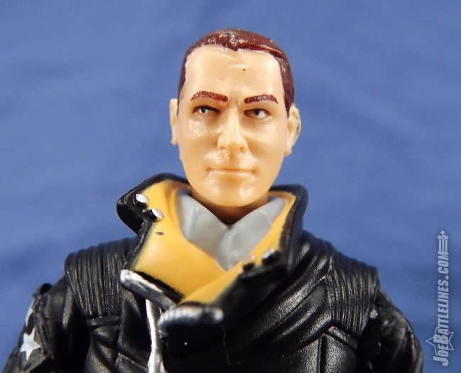
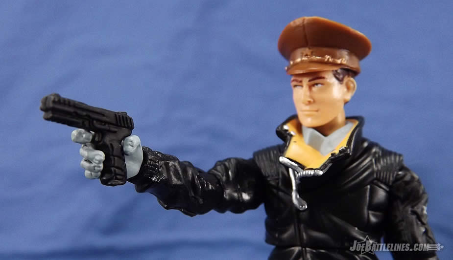
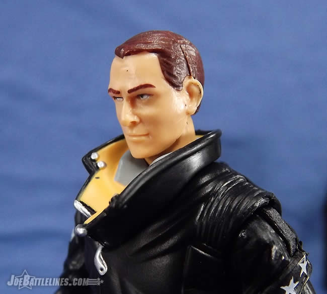
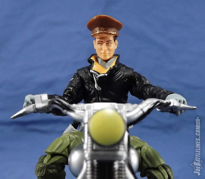
Hey kids, it’s the 25th Anniversary Airborne head once again! That’s right-- this month subscribers were fortunate enough to get not one but TWO figures that used this head sculpt! Isn’t it exciting? It’s like the Clone Wars all over again! Not to mention that the Airborne head isn’t the best fit on this body and the good general ends up perpetually looking downward. I don’t know… with all of the head choices out there it seems poor planning to ship two figures using the same head sculpt in the same month. Whereas I might have been able to ignore the parts reuse now it’s as if the Club deliberately called attention to the fact that Sneak Peek and General Flagg are twins! Sigh… an odd decision for an otherwise solid figure. Freddie! You are putting me to shame with your shouting and snark! I love it! But I need to start catching up! Clearly this should have been a case in which the Club tooled a new hat and head combo. Or even a hat sculpted on the head like Keel-Haul---because really, when wouldn’t his hat be off? But in their classic lazy manner, they just slopped on the good ol’ stand-by head and damn the fan complaints because they already got their interest free loan. We are a bunch of suckers after all. No better than drug junkies, except in this case our smack is plastic and is cut with laziness and poor designs, not strychnine or Fentanyl. But really, the very least they could have done was to ship these two figures apart from each other, that way the duplicate heads might not have been so glaring. (Or at least grayed out the good general’s hair…)
Gear:
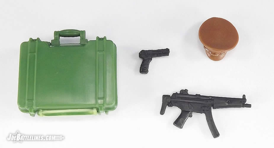
In terms of gear, Flagg’s kit deviates from the vintage figure but with good reason. In 1992, Flagg was equipped with a bizarre action-gimmick accessory and an odd sidearm.
This time around, the good general is packing an MP5 and his trusty sidearm in a belt holder. The MP5 is a great choice as this figure has no trouble holding it in all manner of dramatic pose, thanks to the inclusion of hinged wrists! The sidearm pistol is also a good inclusion even if mine wants to pop out of the holster a bit more easily than I’d like. His firearms are fine, so no complaints there. The Club even made the guns black instead of their usual gray, so that’s a plus. As for the pistols in wider holsters, on those such figures, I just put on a tiny drop of Elmer’s Glue in the holster to keep the weapon secured. And in the rare occasion I’d ever want to remove the gun, the Elmer’s is easy enough to de-glue and wash away. With that said however, I can’t say Iike the pistol belt. It’s too large, so it’s very loose and “spinny” on the figure’s waist. Then there’s the case of it siting way too low---as in right in from of his groin. I don’t know of too many guys who would want to wear a belt buckle placed up against their man-junk. Sorry, but that will not cut it as an athletic cup…
The two remaining accessories are where I find myself scratching my head a bit. The peaked cap is a reuse that dates back to the 25th Anniversary comic packs where it was included with Red Star. Later in 2012 it was used for the Joe Con “Operation Bear Trap” Colonel Brekhov of the Oktober Guard. Both times, the cap was used (rightfully so, based on its design) for RUSSIAN military officers. Sadly, the Club was faced with a choice-- reuse the Russian hat or retool a new accessory. Being the thrifty Club we all know and love, they went for the parts reuse. The cap is problematic. There is no design to it, and it’s missing the required embroidered motifs. Heck, even a simple tampo eagle decal would have sufficed. But as usual, the Club cut corners.
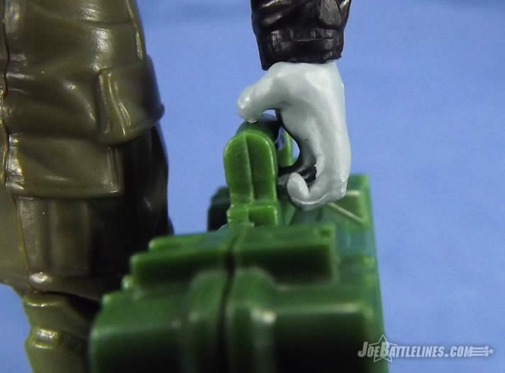
The briefcase is the head-scratcher for me. The was the case that was originally released with the 30th Anniversary Destro. The insert of the case was printed to simulate rows of stacked dollars and Euros. Now, rather than give the General a case of cash, the Club chose to print what can only be described as “some manila folders” over the top of the insert. Sounds like a clever idea, right? It would be-- except that the deco fails to line up with the sculpting underneath in any meaningful fashion. The result is an accessory that just feels-- cheap. Honestly, the Club could have reused Salvo’s briefcase here and I don’t think anyone would have batted an eye.
“Dear Mr. Meyer, the manila folder detail and the colored ink on them was such a large expenditure; we were unable to afford additional tooling for a new head and hat. We felt this was the best option for making this the most vintage accurate and most modernly iconic version of General Flagg Jr. possible. We’re also confident the quality of this accessory more than out-weights any concerns for other new tooling. Sincerely, The Official G.I. Joe Collectors’ Club, LLC”
Conclusion:At the end of the day, is General Flagg worth adding to your Joe collection? I’m just going to come out and say it-- I believe he is! When the mockup for this figure was first show, I wasn’t too thrilled. The parts choices and color scheme evoked memories of both Brando and Colonel Hogan from Hogan’s Heroes. In my mind he was either a biker or a Bob Crane look-alike. However, getting the figure in hand I have to say that he’s jumping to the top of the list for FSS 5 already. (Yes, I realized that we’re only three shipments in at this point. Don’t judge me!) There’s just something about this combination that works and I find myself digging this figure more and more as I look at him. In fact, the whole “biker jacket” kind of works with his original file card which stated that Flagg was someone who wanted to lead his troops from the field, right from the front lines. As such, Flagg comes across as a “man of action” which is precisely what the G.I. Joe team respects. I dig this figure far more than I’d have thought and he’s absolutely a solid addition to any collection. Of course, that’s just this Joe fan’s opinion. The Bottom Line: With his biker-esque appearance and solid parts build, Flagg is very much a worth addition to a modern Joe collection. Just don’t look inside his briefcase! Big surprise here Fred-O, but I do not think he’s worth it. He’s basically an older version of d-bag Mutt Williams from that last dreadful Indiana Jones movie. His colors are boring, those dainty gray gloves look like Lady Isotoners Gloves , and the lack of a hew head and cap PLUS the reuse on Sneak Peek is a sin. Fans can just take a 25th General Hawk body and toss on Airborne head, and that’s a more accurate custom without having to dish out $40.00 on Club trash. My Bottom Line (and I stress bottom): He sucks as is, but new head tooling would have salvaged this figure.
|


| Copyright 2003 JoeBattlelines.com |
|---|