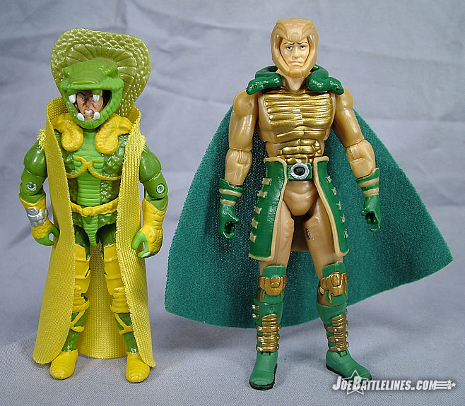
Confession time: I was never a fan of the original design of the ARAH Serpentor figure. Now, before the cries of “not a fan” are shouted across the web, just hear me out. The original figure, while nicely sculpted, just had a bit too much going on in terms of design for me, even as a child, to truly enjoy. The figure had a gigantic snake head helm that completely obscured the figure’s face, as well as a weird snake-hood back plate and a cloth cape. (Okay, what was up with that hood anyway? Seriously, do people really like that piece?) In order to play with Serpentor as a child, the cloak and hood had to go—and were promptly tossed into my parts box. Flash forward to the Devil’s Due run of GIJoe: A Real American Hero—Serpentor re-emerges with a sleek new design and I’m hooked. Gone are all of the over-the-top accoutrements that always kept me from taking the design seriously. Instead, the Cobra Emperor is sporting a slick hi-tech look that actually looks practical on the battle field. When I saw the first pics of the 25A Serpentor figure, I was hooked.
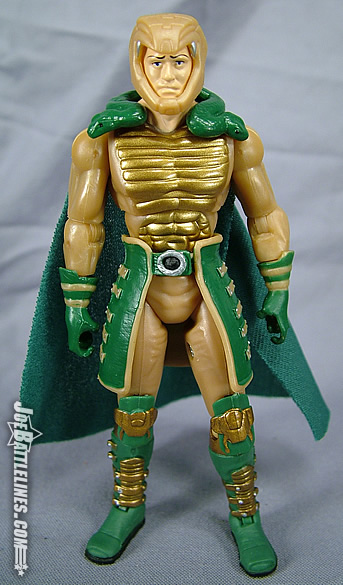
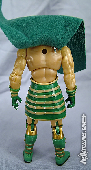
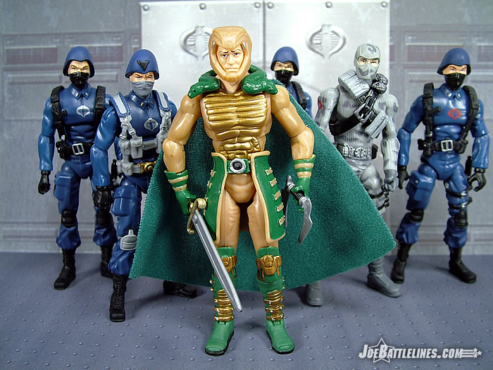
It’s become obvious by now that the entire 25A line is designed around the concept of a generic body design with detailed accessories added to flesh out the character. In keeping with this concept, Serpentor’s character design is really quite plain—almost to the point of minimalism. His “battle uniform” seems comprised almost entirely of a plain goldish-tan suit with gold padding across the chest and abdomen. His hands are covered in a pair of green gloves adorned with two golden bands across the forearms. The legs below the knees are completely covered in a pair of green and gold boots—complete with stylized snake motif kneepads as well as gold plates over the shins. Lastly, as an homage to his classic look a dual-headed serpent sits across his shoulders. However, aside from these details the rest of the body is entirely plain. At first this seemed a bit lazy on the part of Hasbro. After all, the original Serpentor was clad in a flamboyant snake motif armor that practically beat you over the head with the theme of “Cobra”. Yet, the more I look at this figure design the more I realize that this figure espouses all that I liked in the DDP comics update. This armor is functionally simple—without all of the over-blown touches that distanced me emotionally from the original Serpentor figure. In other words, this is actually armor that you could see the Cobra Emperor fighting in; a battle suit that he could actually fight unencumbered in. Aside from the green and gold Roman-esque rubber skirt, there is virtually nothing to hamper his movement which is something that a “hands on” commander like Serpentor would want. So, while a number of fans are denouncing this figure as “not the original”, I’m finding myself more and more drawn to this streamlined updated Serpentor.
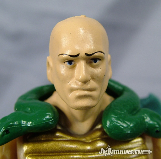
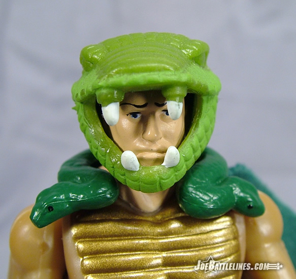
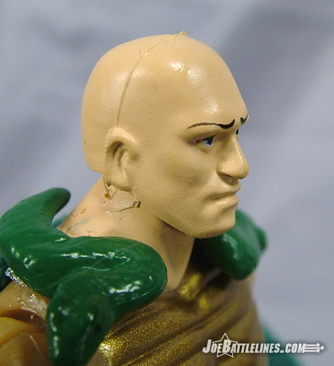
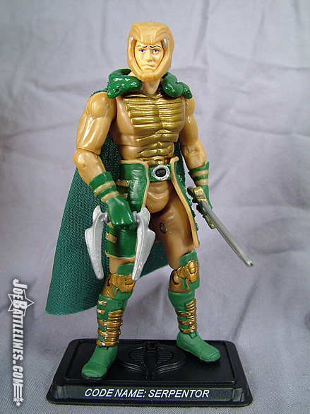
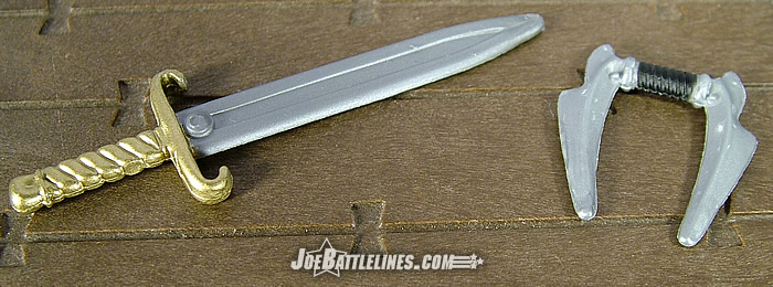
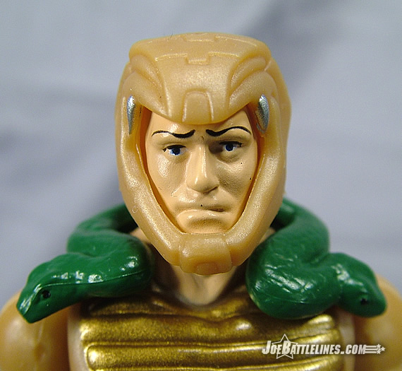
One of the odd traits in the 25A line thus far is the predominance of shaved heads found in the cast of characters. It seems that everyone who features a removable has decided that having hair is “just so last week” and has opted for a shaven head. Serpentor is no exception to this rule and his head is presented without so much as a “Charlie Brown” squiggle. Whereas the Comic Pack version feature a pompadour hairdo that Elvis would have killed for, this one is going Vin Diesel/Patrick Stewart all the way. Now, in all honesty this really isn’t an issue unless you plan on displaying the figure without his Comic Pack #16 helmet worn yet there is a way to explain his lack of hair quite simply for those fans who need a reason. This figure represents Serpentor fresh out of the cloning tanks—his eyebrows have only just come in and the rest of his hair hasn’t had time to develop fully. See? The whole “bald issue” is solved in one quick sentence! Serpentor comes equipped with the DDP-inspired helm that was included in Comic Pack #16, a short sword, and wicked dual-bladed weapon that I’ve yet to find the real name for. (When I do I’ll update the review to reflect the most accurate information.) Another point to mention is that a lot of fans have expressed consternation as to the decidedly neutral expression that the Cobra Emperor is wearing. Personally I think that this is almost a response to the exaggerated features seen in the release of the figure from Comic Pack #49 where Serpentor resembled nothing so much as a snarling Bruce Campbell. I find this expression to be a bit more pensive than neutral but do agree that is almost a bit too bland for a figure that has such a neutral color scheme. Still, I like this update to old Snake Head quite a bit and can find little fault with the sculpting on this figure.
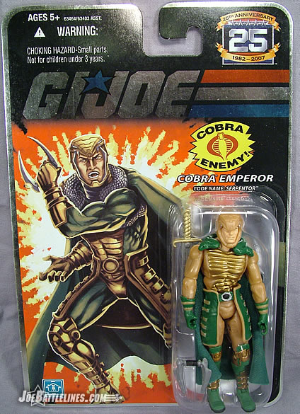
If you look carefully at the card artwork for Serpentor and then at the figure itself you’ll notice that the color scheme for the design is actually reversed in the artwork. On the card, the figure is predominantly green, with gold armor across the chest and golden gloves and boots. For some reason the production version of the figure reverses this while still maintaining the golden chest plating. Quite honestly, I think I would like this figure even more if he was released with the card art color scheme but I have the feeling that this change was made to differentiate him from any future releases of the “classic” Serpentor. I like the gold look but think that the ‘flip flop” of the colors would have made a great figure even better. The only other downside to this figure is that the rubber skirt on the waist restricts the movement of the legs quite a bit. Removing the skirt isn’t an option as the belt actually fits into an indent in the figure’s waist. Take away the belt and Serpy is missing some flesh that probably shouldn’t be missing. While I tend to pose most of my 25A figures in standing positions this motion limitation prevents any “throne” poses that fans might have wanted the figure to achieve.
Look, I understand that many fans want this line to consist of nothing more than new reproductions of the classic 80’s designs for the respective characters. However, I have a hard time dismissing this particular figure simply because he’s “not the original”. I tend to like updates that are faithful to the spirit of the original design while still bringing the character forward 20 years. As such, I’m finding that I really like this figure for the updated look that it is. Serpentor has a very regal bearing in this incarnation that simply wasn’t found (for me) in the original. Should Hasbro decide to release a more classic Serpentor figure I’ll happily snag him but for now I’m more than content with this particular version of the “oft-dead” Cobra Emperor.