NOTE: This “tag team” review features text by both Fred “Leonardo T Dragon” and Justin “General Hawk” Bell. Fred’s text appears in standard text while Justin’s will be rendered in bold.
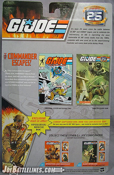
Over the years Hasbro has demonstrated a talent when it comes to the “repainted” figure. Going back to the early waves of the “GIJoe vs. Cobra” series, fans were treated to multiple releases of the same figure – each time with a different color scheme. In many cases these repaints either improved upon the original release or opened up a new possibility for that particular figure. When the comic pack line debuted back in 2004, Hasbro took their penchant for repaints in a new direction—striving to replicate the exact appearance of a particular character from an issue of the Marvel Comics GIJoe: A Real American Hero comic series—right down to the color of inks used. In many cases, this has resulted in some figures that were a bit “brighter than the norm”—most noticeably in the original Comic Pack #24 released under the Valor vs. Venom theme. However, nothing prepared me for the 25 th Anniversary return to that same issue. While Justin writes his thoughts, I’m going to go grab my sunglasses. After all, I don’t want to permanently burn these two figures into my retinas. Justin?
Yeah, while I applaud Hasbro’s desires and intentions to make these figures jump off the “page” so to speak, I don’t necessarily think the bright primary colors of a comic page necessarily translate seamlessly to the three dimensional world. I mean Marvel Legends figures are based off comic appearances, yet Toy Biz (and now Hasbro) goes out of their way to add detailing to LESSEN the overt brightness of their look in the comics. These figures, however, take the opposite approach.
In some regards, I don’t mind it too much. I actually dig the somewhat brighter colors on the old school comic pack Roadblock, Scrap Iron, and Serpentor…it kind of gave them some additional character. But to each thing, there is a limit.
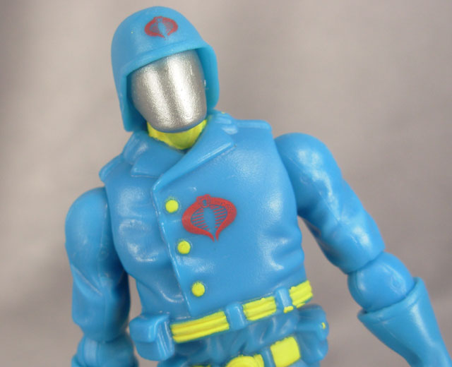
Cobra Commander:
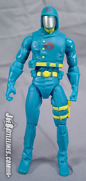
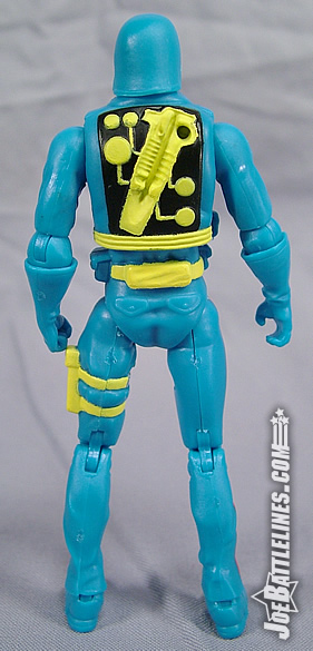
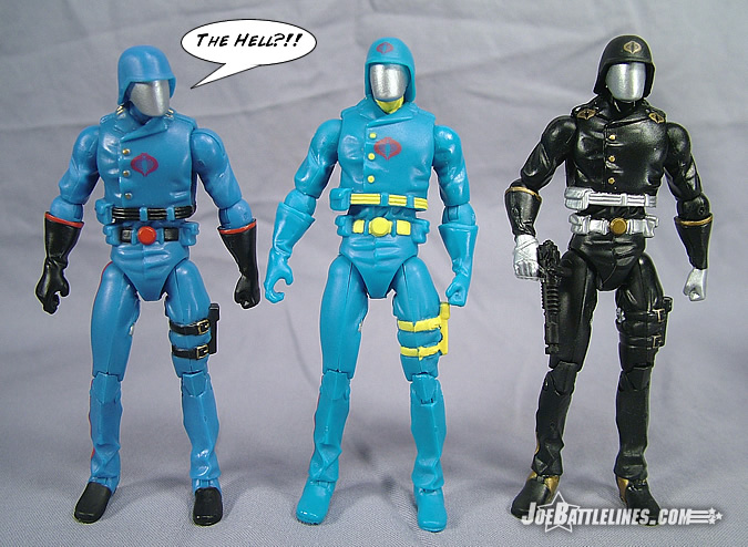
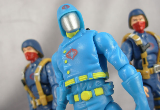
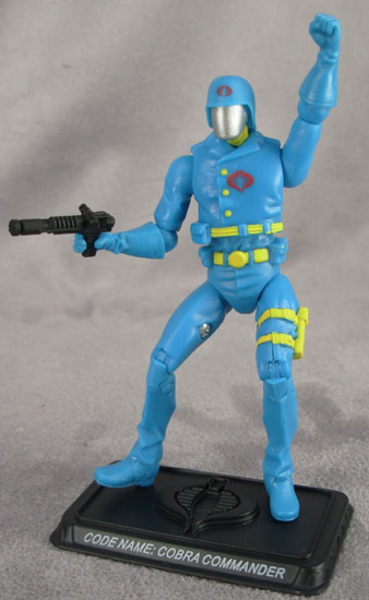
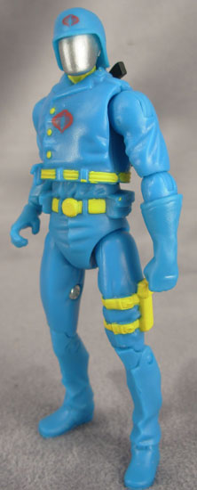
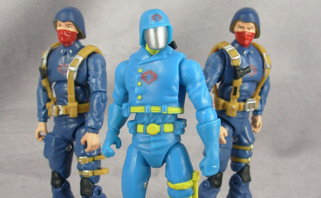
When I first grabbed this pack off of the pegs at a local Target store my fiance’s first words were “they made Cobra Commander out of Play-Doh?” I’m almost at a loss for words when it comes to this figure and the color choices used. Seriously—I honestly don’t know where to begin on just how utterly hideous this figure is. Perhaps it’s the lack of paint applications or the utterly garish nature of those that were used but to state that this figure is an eyesore is an insult to all things that cause ocular pain. The color of blue used in the body literally and the burning hue of yellow used for the painted details manage to strip all menace and intimidation out of a character once referred to as “the most dangerous man alive.” (Okay, now he’s only dangerous to those in the fashion world!) Combined with the lack of detailing found on the body and this figure really does look like he came out of one of those Play-Doh molding kits that most people my age remember from their childhood. Only the silver face plate seems out of place as the result of this figure shows just what a difference a really bad color scheme can make. I appreciate that Hasbro is trying to replicate a comic book appearance with this figure but YIKES! Now that Justin is wearing the proper eye protection, I’ll pass the keyboard over to him for his take on this.
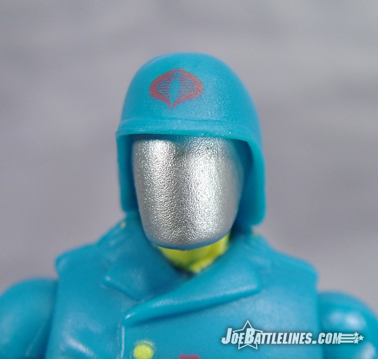
COBRA Commander is far and away the worst offender of these color choices. This blue they chose actually isn’t a whole lot brighter than his standard baby blue that the original version came in. It’s surprisingly close when you compare the two figures side by side. The trick comes in the paint trim. Where the original Commander was trimmed with dull red and black, this version has yellow. This bright yellow trim really brings out the obvious brightness of the underlying blue and ends up making the entire figure look nearly radioactive. In this case I think Hasbro went a bit overboard, and COBRA Commander becomes almost comical. Not “comic”, but “comical”. ;)
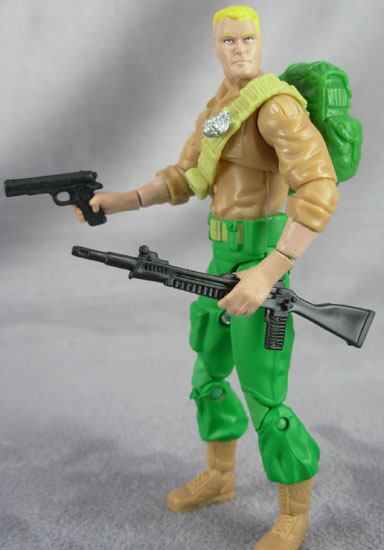
Duke:
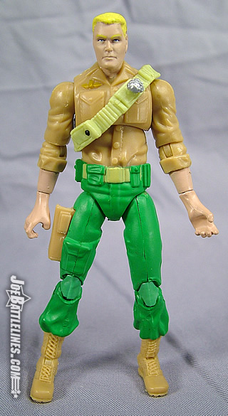
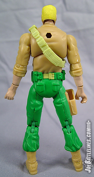
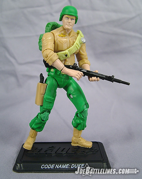
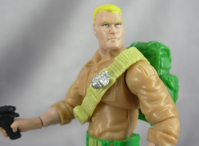
Fairing only marginally better than the leader of the “ruthless terrorist organization determined to rule the world”, the GIJoe team’s First Sergeant looks more like he belongs in an episode of Sunbow Animation than leading a counter-terrorist team. Duke’s color scheme is roughly the same as the Battle Pack and single-carded versions—with the exception that all of his colors have been turned up on the “neon-o-meter”. (This device saw heavy use back in the early 90’s until it was banned by an act of the United Nations on the grounds of the permanent eye damage it caused to countless civilians.) Duke’s pants are a shade of green that even members of the Mega-Marines might question. Duke’s shirt fares somewhat better—and would actually work for a “clean” version of the First Sergeant. In fact, I’d so far as to say that if it weren’t for the shades of green and yellow used, this figure could almost fit into the “regular” 25A line with very few problems. However, the pants and the “bleach blonde” hair just about kill the figure for me. It is interest to note, however, that the change in colors used gives Duke’s face a decidedly more menacing expression—even with the bad dye job. Okay, I’m out of snarky things to say so I’m just going to turn this over to Justin now.
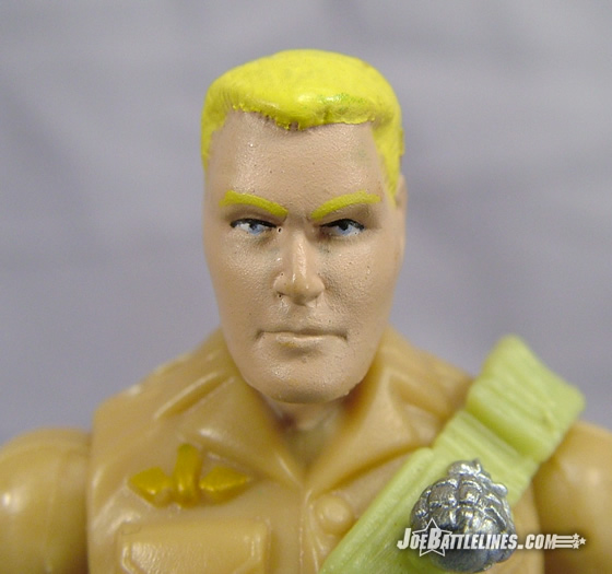
See, I’m a lot more forgiving on the Duke figure than Fred is. Yes, this version of Duke is a bit brighter than his normal counterparts, but not so much that it’s hurtful to the eyes. His shirt actually looks pretty close to the standard tan color, with a slightly brighter green shade on his pants. Where the Commander’s overly bright colors make him look unrealistic, the brighter colors on Duke just make him look a bit more “animated” which is cool. I’ve actually given him a version of the familiar Snow Job laser rifle and he’s paired up with Comic Pack Scarlett right now on my display shelf, which is just the beginning of what will be my “Sunbow display”.
One of the cool things about these Anniversary figures is that they’ve really cranked up my “nostalgia-meter”. Just by seeing and buying these toys, I’ve almost immediately become nostalgic for all of the classic elements that made G.I. Joe great back in the day, including the cartoon, which I’ve never had an attachment to in the past. I kind of like having these brightly colored figures that look cartoon-like to separate them from my more “Standard” collection.
Yikes—for some reason a paraphrase from Star Trek II: The Wrath of Khan seems appropriate in describing Hasbro’s attempts to release a comic pack of issue #24. “You’ve managed to produce everyone else but like a poor marksman you keep missing the target!” This particular issue seems to be the one that Hasbro just can’t put together without dipping into that can of forbidden neon paint. The previous release featured “Banana Pants Brigade” Roadblock and “REALLY Blonde” Duke; this 25A version is no different in the respect that the colors really do hinder my enjoyment of the figures included within. Press images released show that future comic packs are going to be infinitely superior to this initial wave but even I have a hard time rationalizing a purchase of this pack. Sure, the Cobra Commander figure is good for comedy but how many Play-Doh jokes can a writer make before he’s flogging a dead horse? Duke comes closer than his nemesis in achieving legitimacy in my eyes but when he gets to the greens he just turns left and heads straight toward Neon Town. If fans are looking to skip one of the packs, this is the one to leave behind. Final thoughts, Justin?
As I said earlier in the review, I actually don’t mind the “banana pants Roadblock” and I think I have found at least a small part in my collection for these bright figures. But really, I will be honest here…part of it is a rationalization. As folks know I’m a completist, so I buy everything, so sometimes I need to find a reason to own particular figures. I’ve rationalized the owning of these comic packs, but truthfully I can find reasons why people aren’t fans. I do agree with Fred, if you’re not a completist and you don’t need to send off the points for Doc right away, you can skip this pack, there’s nothing that will pressure you to own it.
But the fact remains that now that I have Comic Pack Duke and Scarlett in my display, I find myself really enjoying these brighter colors, and at least part of me will be looking forward to some of these brighter figures coming out in the future.